Responsive Website Design
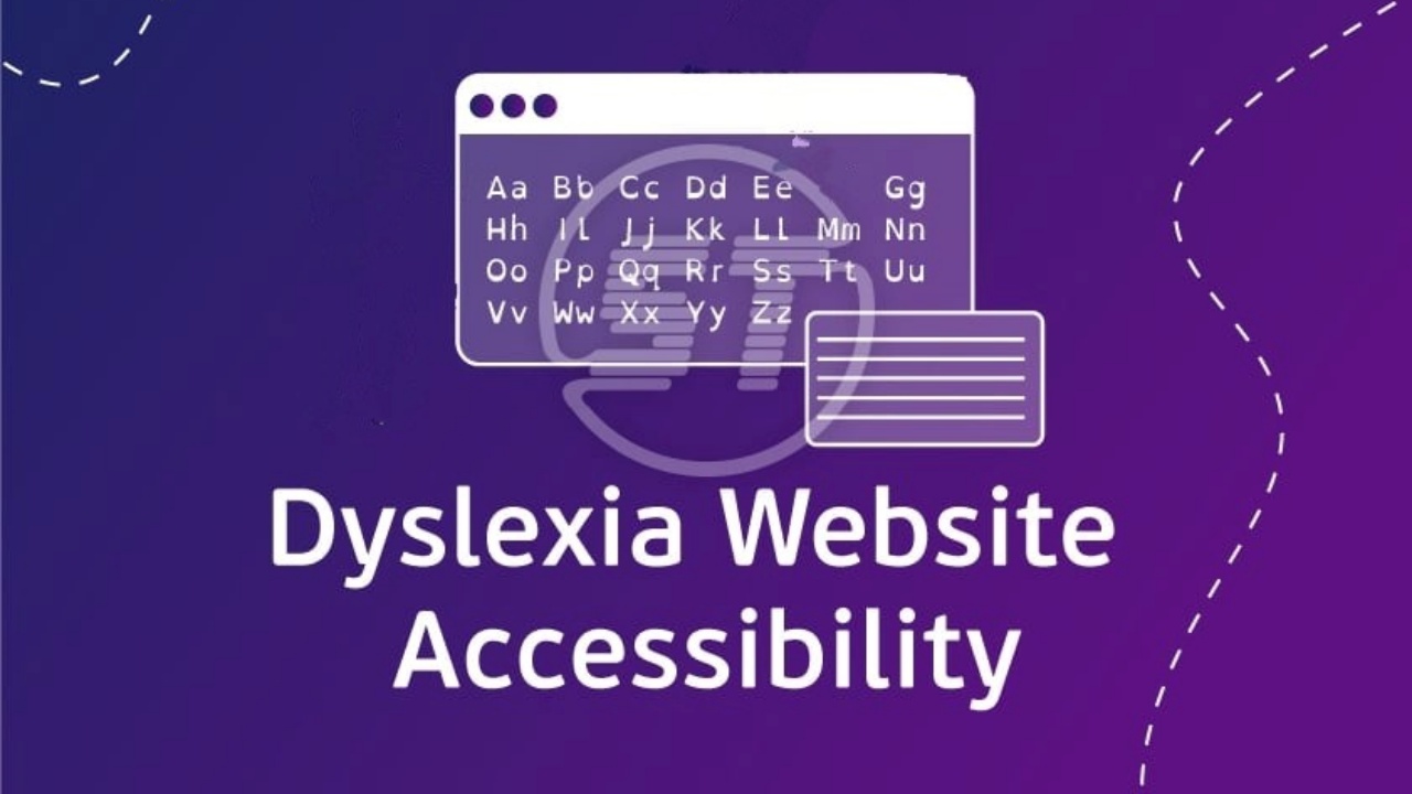
Dyslexic Guidlines
People with dyslexia should generally avoid fonts that are highly decorative, overly stylized, or difficult to read due to intricate letter shapes. Serif fonts such as Times New Roman and Garamond should be avoided as their complex designs can make reading more challenging for individuals with dyslexia.
People with dyslexia have noted a preference for black text on Gray, Yellow, Peach or Orange backgrounds. This allows them to read and digest information in a more efficient way.
Font sizes should be between 12 and 14 pt is optimal for dyslexic readers. Although, in niche instances a larger font type may be required to improve user experience.
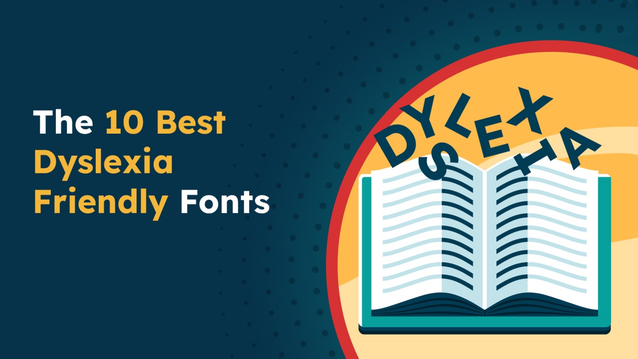
Examples of dyslexic friendly fonts are Arial, Calibri, Courier, Dyslexie, OpenDyslexic, Tahoma and Verdana.