 Responsive Website Design
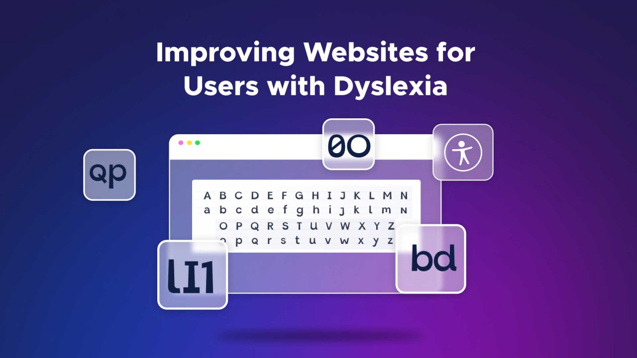
To make websites more accessible for people with dyslexia, prioritize readability through sans-serif fonts, larger text sizes (12-14 points), ample spacing between letters and lines, and clear visual structure with headings and consistent formatting, while avoiding distracting elements like patterns or excessive use of colors.
![]() People with dyslexia should generally avoid fonts that are highly decorative,
overly stylized, or difficult to read due to intricate letter shapes. Serif fonts such as Times New Roman and
Garamond should be avoided as their complex designs can make reading more challenging for individuals with dyslexia.
People with dyslexia should generally avoid fonts that are highly decorative,
overly stylized, or difficult to read due to intricate letter shapes. Serif fonts such as Times New Roman and
Garamond should be avoided as their complex designs can make reading more challenging for individuals with dyslexia.
![]() People with dyslexia have noted a preference for black text on Gray, Yellow, Peach or Orange backgrounds.
This allows them to read and digest information in a more efficient way.
People with dyslexia have noted a preference for black text on Gray, Yellow, Peach or Orange backgrounds.
This allows them to read and digest information in a more efficient way.
![]() Font sizes should be between 12 and 14 pt is optimal for dyslexic readers.
Although, in niche instances a larger font type may be required to improve user experience.
Font sizes should be between 12 and 14 pt is optimal for dyslexic readers.
Although, in niche instances a larger font type may be required to improve user experience.
![]() Clickable links and areas should be large to help users who cannot
control a mouse with precision.
Clickable links and areas should be large to help users who cannot
control a mouse with precision.
![]() Examples of dyslexic friendly fonts are Arial,
Calibri, Courier, Dyslexie, OpenDyslexic, Tahoma and Verdana.
Examples of dyslexic friendly fonts are Arial,
Calibri, Courier, Dyslexie, OpenDyslexic, Tahoma and Verdana.
![]() Simplified Letter Shapes: Dyslexia-friendly fonts often have simpler, more straightforward letter shapes that reduce
confusion between similar letters, such as “b” and “d.”
Simplified Letter Shapes: Dyslexia-friendly fonts often have simpler, more straightforward letter shapes that reduce
confusion between similar letters, such as “b” and “d.”
![]() Clear Letter Spacing: Increased spacing between letters and words helps prevent crowding and overlapping, making it
easier for readers to discern individual letters and words.
Clear Letter Spacing: Increased spacing between letters and words helps prevent crowding and overlapping, making it
easier for readers to discern individual letters and words.
![]() Uniform Letter Height: Fonts that keep letters at a consistent height can reduce the tendency for letters to be
rotated or flipped, which is a common issue for some people with dyslexia.
Uniform Letter Height: Fonts that keep letters at a consistent height can reduce the tendency for letters to be
rotated or flipped, which is a common issue for some people with dyslexia.
![]() Gray Background
Gray Background
![]() Black or High Contrasting Text
Black or High Contrasting Text
![]() Easily Read San-Serif Fonts
Easily Read San-Serif Fonts
![]() 14px-24px Readable Font Sizes
14px-24px Readable Font Sizes
![]() Ample Line Spacing
Ample Line Spacing
![]() Ample Letter Spacing
Ample Letter Spacing
![]() Uniform Letter Heights
Uniform Letter Heights
![]() Avoid Text Italics and Underlining
Avoid Text Italics and Underlining
![]() Clear and Simple Language
Clear and Simple Language
![]() Headings and Subheadings
Headings and Subheadings
![]() Images for Clarification
Images for Clarification
![]() All Headings are Sequential
All Headings are Sequential
![]() Clear Consistent Navigation
Clear Consistent Navigation
![]() Bold and/or Colored Hyperlinks
Bold and/or Colored Hyperlinks

HOME
Columns:
Tech Fixed Nav
HTML CSS
Technology Stack
PHP JavaScript Python
SQL AJAX XML PERL
Five Six Seven Eight
Database 1+2+1
LLMs Expand
ADA Website Compliance
Dyslexic Guidelines
OSI Model
Layouts:
Dark Web 1+2 Layout
Protocols 1+3 Layout
Malware 1+4 Layout
Code Sharing 2+4 Layout
Search Engines 3+1 Layout
Custom ROMs 4+1 Layout
AI Websites 4+2 Layout
Offset 70-30 Layout
Cloud Services 1+2
Top Level Domains
ZigZag Layout
Database:
Database Select Query
Database Sort Query
Database Select Europe
Database Select Japan
Database Select US
Database Select Vehicle
Photos:
Photo Full Width
Photo Gallery
Photo Grid
Photo Carousel
Photo Album
Photo Filter
Photo Select
Photo Accordion
Photo Zoom
Photo Scroll
Quizzes:
Web Design Quiz x3
Web Design Logo Quiz x3
Web Coding Quiz x10
Web Development Logo Quiz x10
Graphics:
Background Colors
Background Refresh
Graphic Design
Image Formats
Images Per Page
Material Cards
Search Engines
Browser Tier List
Magnify Window
Autonomous Companies
Website Standards
Plethora:
Technology Chart
Parsing Python Scripts
Frameworks
Shopping Cart
Website Standards
AJAX Interactive XML
W3C
XHTML
Website Coding
Fediverse
Large Language Models
About Eddie Jester